The four winners of the Visibility Leaders Women’s Fashion study are Boohoo, Simply Beach, Real Simple and Vogue. The hibs shown below represent some of the most successful SEO projects in the business and the analysis here will help you understand why.
- The Winners - ‘Do’
- Boohoo.com - maximising visibility for maternity wear
- Bravissimo.com - winning with their size landing pages
- The Winners - ‘Know’
- RealSimple.com - a comprehensive hub of fashion trends and advice
- Vogue.com - a trusted content hub for all things fashion
- Summary & additional interesting observations
At the moment, category pages and commercially-focused content formats still drive considerable traffic and revenue in the search results for brands and retailers alike. As proven by our most recent Visibility Leaders analysis, where this time we are looking at women’s fashion. So as much as winning in organic search is about having a future proof strategy, it’s also about nailing the fundamentals and using strategies that are working right now.
eCommerce has seen some pretty large growth over the past 5 years. In the House of Commons Library research it was estimated that around 20% of retail purchases in 2019 came from eCommerce. In 2023, this grew to 30%, dropping from a peak of 37% during February 2021. Yes, the pandemic has accelerated this growth, but we would end up getting here anyway. This data and the regression of retail sales after the peak of the pandemic suggest bricks and mortar is here to stay. Further to that it’s entirely possible that eCommerce growth as a share of overall retail sales will have a glass ceiling — where that ceiling is, remains to be seen.
All commercially driven businesses (like those in eCommerce) are typically focused on one key metric; revenue. Year-on-year revenue growth is what eCommerce businesses strive for. Yet, recently that YOY revenue growth has been hard to come by due to our comparison periods being against a period of inflated demand. So how do we continue to grow YOY? Largely the opportunity lies in previously untapped opportunities and taking market share from competitors. This can be achieved by leveraging trends and dominating niche topical areas with expertise – which is what we see from all high performing sites analysed as part of this analysis piece, not just our winners.
The Winners – ‘Do’
The winners in this section are from directories where the majority of the keywords they rank for are of commercial intent and match the ‘Do’ intent within SISTRIX. In the context of this analysis the ‘Do’ intent keywords are largely relating to the ultimate goal being the purchase of clothing.
As intent is a largely nuanced thing, the keywords tagged as ‘Do’ can be of varying distances away from the actual conversion in the user journey. For example, searching ‘summer dresses’ is likely to be a browsing journey through commercially-leaning landing pages, whereas ‘buy red floral summer dress’ is likely to be closer to that purchase point.
The full list of searchable and sortable directories is available on the Visibility Leaders overview page for women’s fashion.
Boohoo.com – maximising visibility for maternity wear
The large winner for ‘do’ keywords in women’s fashion is Boohoo.com with their /maternity/ directory. Boohoo is a large fashion retailer that operates predominantly online selling both mens and womens clothing from their range. While Boohoo has a large brand presence, they primarily rely on non-brand keywords for their deeper category pages.
Boohoo are typically a high performer across their entire site within organic search. However, their maternity wear has the highest ratio of first page positions. Technically, their site has multiple high performing content formats and even their entire /womens/ category would be classified as a high performing content format.
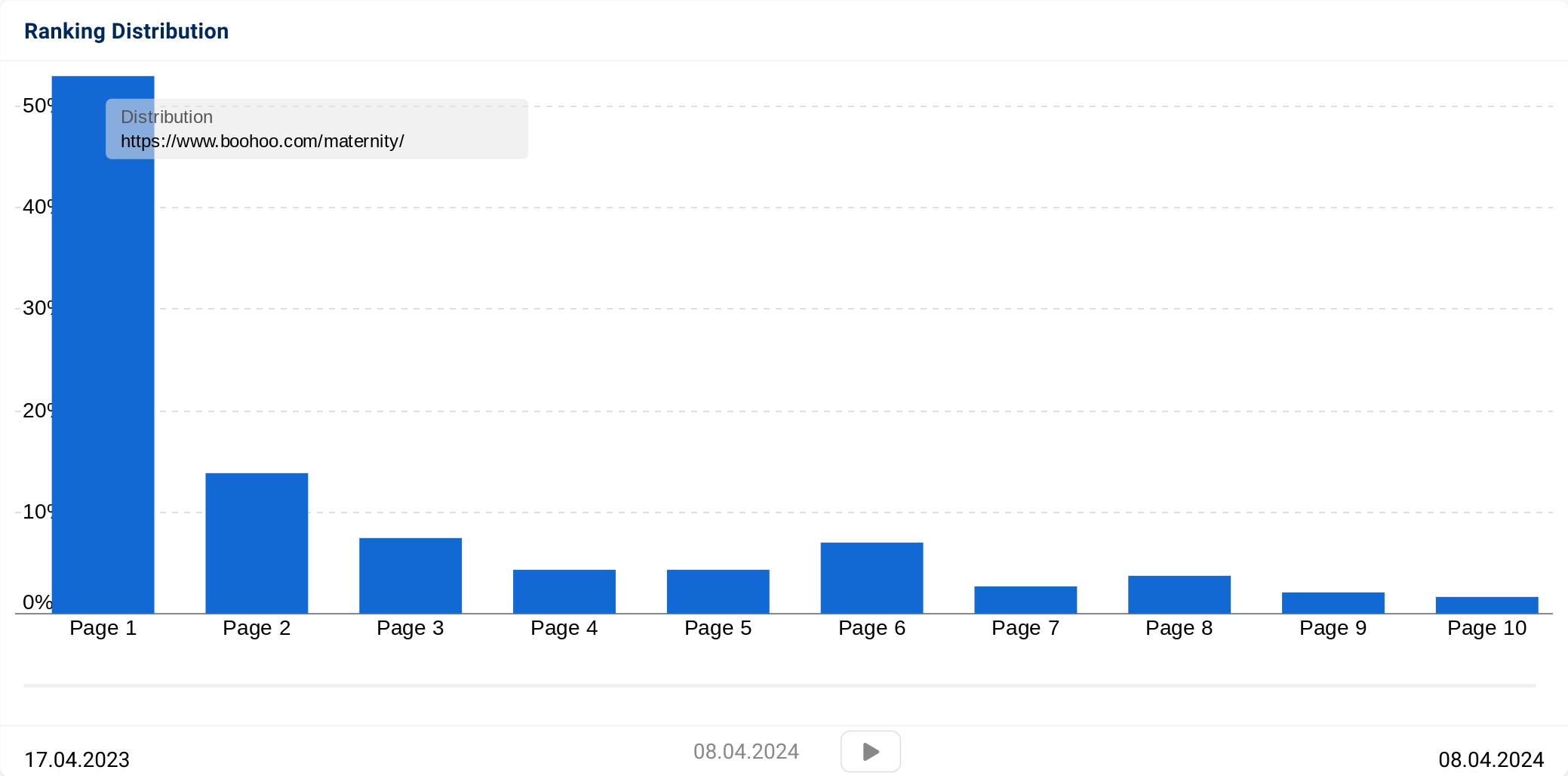
Currently, their /maternity/ directory is ranking for 2,738 keywords in the UK with an impressive 54% of these ranking on the first page. Within this directory visibility is largely driven by two pages; maternity pyjamas and maternity dresses. Together, these pages account for just under 50% of this directories visibility. This is largely a search volume related factor as most of their ranking URLs within this directory are mainly on page 1, yet pyjamas and dresses have the highest search volume out of the whole maternity clothes keyword universe.
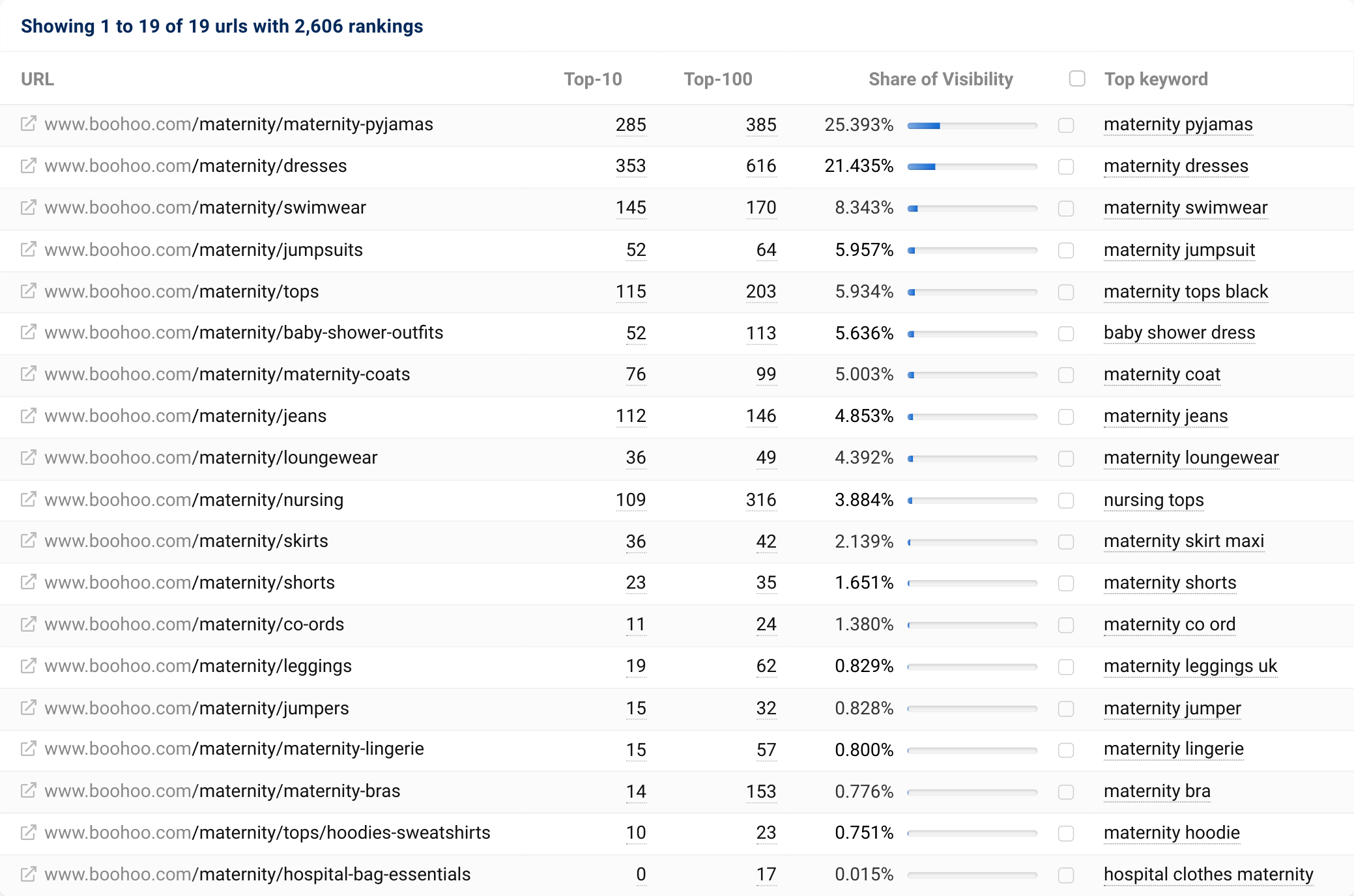
As for what Boohoo are doing well, it pretty much boils down to the following:
- Category coverage– Boohoo does this really well. If there is search demand for a product category, Boohoo will probably have a landing page for it. Examples of this are their landing pages for “baby shower outfits” and “maternity co-ords”.
- The internal linking structure baked into the Boohoo site provides a solid path for authority to reach deeper, high value categories. They use linking modules in both the top banner and footer to achieve this across the site.
- Category content at a deeper level, such as adding specific and relevant content on “maternity hospital bag essentials”. While this is a high effort initiative with unpredictable rewards, it certainly helps add relevance to the categories sat within their maternity structure.
- Linking to high value sub-categories from their mega menu – This is done across their entire site. For maternity wear, you can see examples of this with their “baby shower dresses” category.
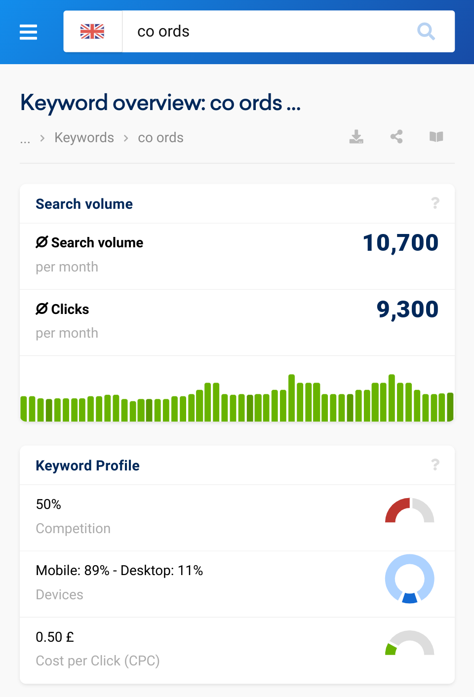
Expanding on my above point about category coverage, Boohoo are great at keeping their category coverage up to date by using the same language their customers use. Creating category pages for trending and new opportunities really does allow them to effectively increase their coverage from an organic point of view.
In the example above, maternity co-ords, you can see a gradual increase in interest over time via SISTRIX data. There are multiple examples of Boohoo doing this outside of maternity, which is just one of many factors that give them great success in organic search.
Their use of internal linking modules also increases discoverability and distribution of internal link authority for deeper category pages. They utilise this in both the category banner section and the footer of the page allowing for easy navigation for both users and bots.
Bravissimo.com – winning with their size landing pages
The small winner for ‘do’ keywords in women’s fashion is Bravissimo with their /shop-by/ directory. This is a directory of all of their lingerie and swimwear by size, which are presented in the typical PLP (product listing page) format. Bravissimo is a retailer that specialises in bras, swimwear and lingerie designed for women with D cup sizes and above. They have a relatively large focus on customer service, with fitting guides and free returns & exchanges which has netted them largely positive reviews.
Their shop by size pages rank for a total of 1,959 keywords in the UK and 66% of those are on the first page of Google. This organic traffic is largely driven by non-brand search. Which is proven by them sitting in the top spot on Google for most bra-related size terms that they cater to, such as “34DD bra” and “F cup bathing suits”.
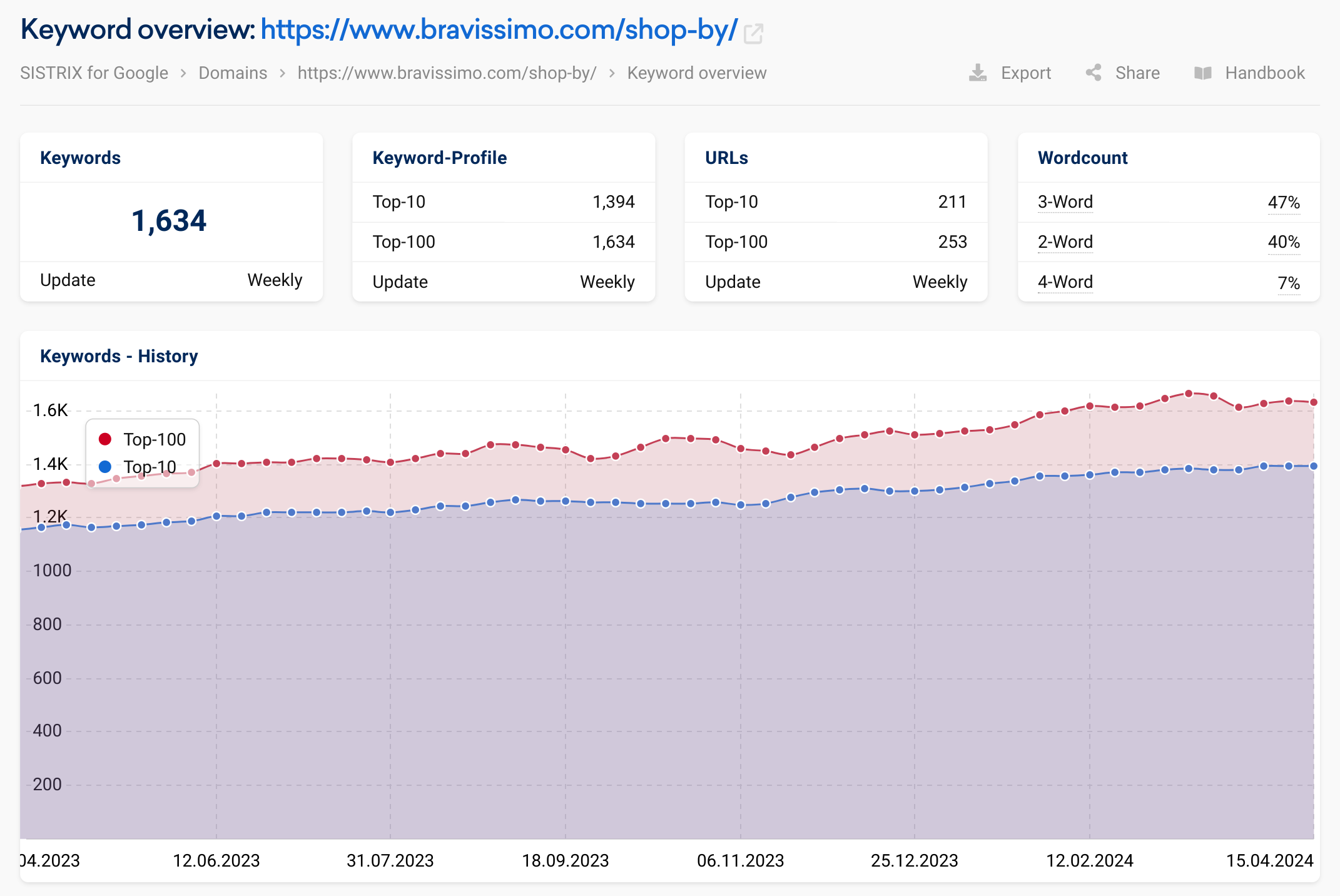
Bravissimo has 256 ranking URLs displaying within their /shop-by/ directory and visibility is largely split over the top 20% of these URLs, which is relatively common to see.
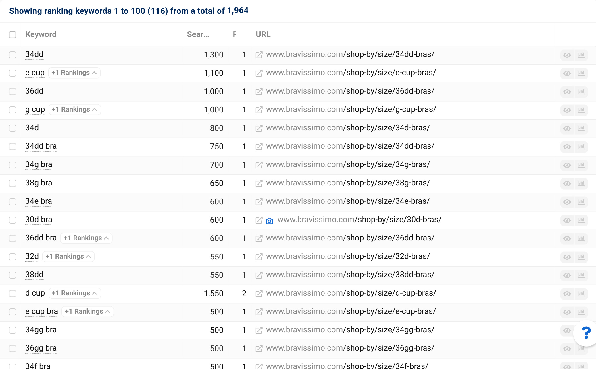
This is a great example of category coverage for a specific facet of a product type, in this case “size”. Bravissimo has built a very detailed menu structure for “shop by size” which translates to mobile relatively well and gives direct, site-wide, links to these size landing pages.
The more common approach that we see from competitors is to index filters from their faceted navigation off a parent category page. For example selecting a size filter on a category page for bras, this approach typically does not provide site-wide internal links. It’s possible that having these site-wide internal links has given Bravissimo a competitive edge.
Looking into everything they are doing that’s contributing to this performance, we can see:
- Category coverage, they’re maximising visibility for size related searches by having indexable landing pages for all size / product combinations that have organic value for them
- Site-wide internal links to these pages, allowing for the sites authority to easily bolster them. As mentioned above, this is not all that common for product + size category pages
- As a brand, Bravissimo clearly has a specific target audience and these category pages align with that incredibly well. Outside of this set of category pages, it’s clear they cater to their customers’ needs and questions, which definitely gives them an advantage in the SERPs. Examples of this are; their free fitting service, both virtually and in person and their free returns and exchanges policy, which is beneficial for finding that perfect fit
The Winners – ‘Know’
As usual, to provide a more rounded view of how women’s fashion is represented in search, we also analysed the highest performing content formats from an informational perspective. It’s common to find informational content on retail sites, but rarely do these perform exceedingly well. In fact, while doing this analysis, it was pretty clear that there are very few high performance content formats as a whole within women’s fashion from an informational search perspective.
RealSimple.com – a comprehensive hub of fashion trends and advice
Real Simple is a publication, largely targeting the US, with content around home, lifestyle, food and style. Naturally, being in the English language, it has had a relatively decent amount of success in the UK search results.
They are winning with their /beauty-fashion/ directory, which covers skincare & beauty as well as fashion. Their directory for beauty & fashion is pretty well-structured with hubs at multiple levels.
These hubs cover things like clothing, shoes & accessories and clothing care at the top level then drill down into more specific topics like jeans and pants, wardrobe basics and swimwear.
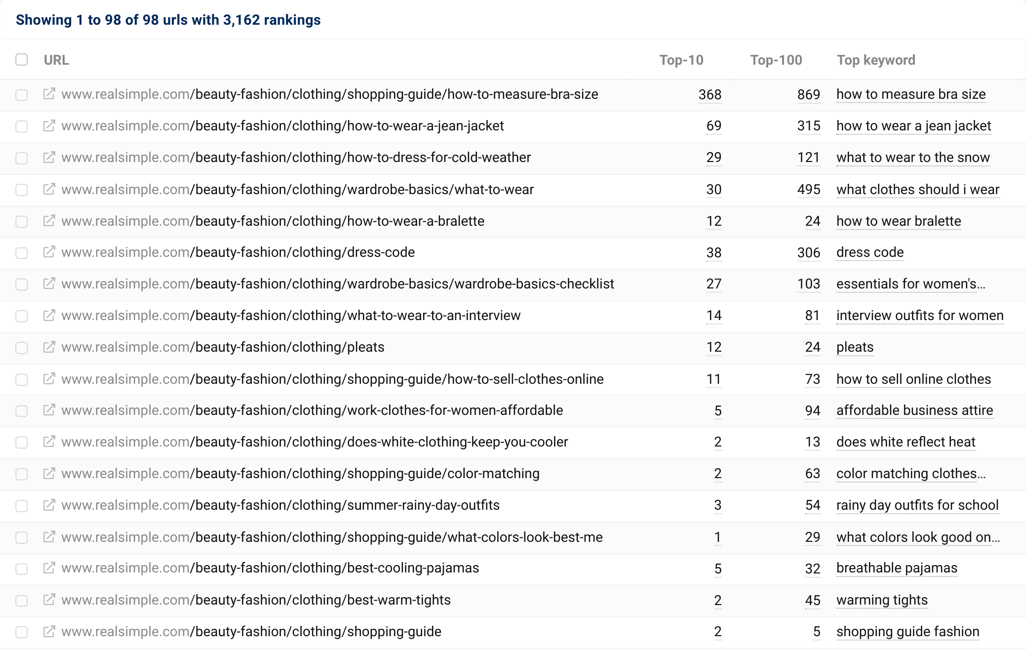
In terms of content within this structure, it’s a mix of evergreen content and trend-related pieces. The evergreen pieces, such as “how to style a jean jacket” or “how to clean white canvas shoes” for example, seem to be performing particularly well. They also use a fact checking process where relevant on their content, which is obviously more important than ever before due to E-E-A-T. This is something we have also seen during our last analysis piece in personal finance.
In summary, here are all the things that Real Simple is doing to perform so well:
- Content hub structure – They aren’t just winning with the content itself, they are using internal linking effectively at a hub level to provide topic hubs containing content that is super relevant to your selection. This is great from both a user experience and SEO perspective.
- Topical expertise and fact checking – Real Simple tends to explore some of their highest performing topics in great levels of detail. Using the example of “how to clean white canvas shoes”, this article has been written by a topical expert and fact checked by a separate individual.
- They use internal linking quite strategically throughout the content format, linking hubs together for increased navigability for both users and bots. As well as internally linking relevant content, which is probably done dynamically, they also add quick links on articles to jump to relevant sections.
- Content structure is also thought about in great detail, their how to’s are structured in a way that doesn’t contain any frustrating fluff and are clearly laid out with steps. They usually enrich this content with a variety of media types including both videos and images to provide the best experience for users.
- Their use of evergreen content also gives their hub defensibility against the seasonal changes associated with fashion. Rather than relying on just new and fresh content bringing in traffic via Google discover, they have a solid evergreen content strategy that brings in traffic all year round from Google search.
Vogue.com – a trusted content hub for all things fashion
Vogue is a publication that is known for featuring a relatively wide range of content within fashion, beauty, culture and lifestyle. They cover latest fashion trends and current events relating to their subject matter expertise. It’s worth noting that this is not strictly “women’s fashion” and covers fashion all encompassing.
This is an interesting winner for informational content as it is the US version of the publication, not Vogue.co.uk, that has come out on top. This is largely due to the site structure itself being different from the UK version of the website.
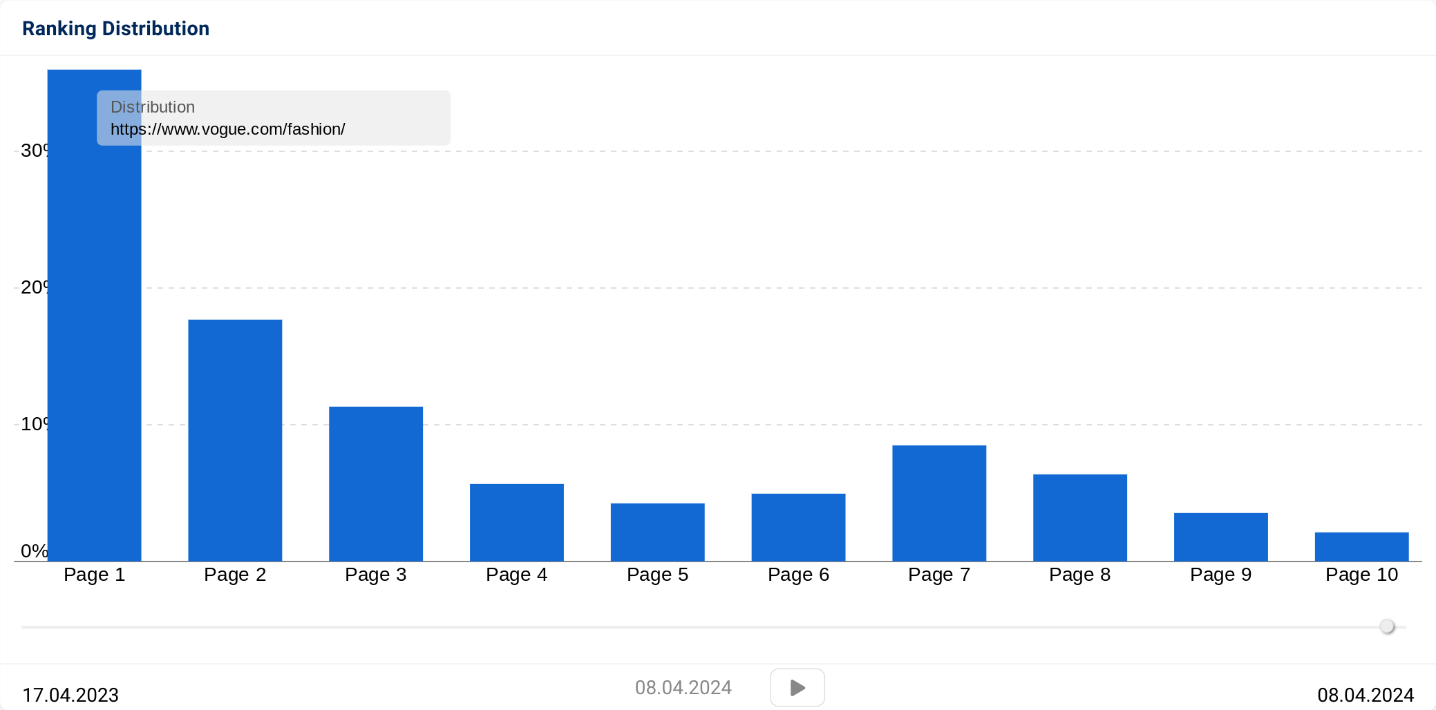
They are winning with their /fashion/ sub-folder, which is ranking for 566 keywords in the UK search results with over 35% of those keywords showing on page 1 of Google. The /fashion/ directory is essentially a content directory that has various hubs such as ‘designers’, ‘celebrities’ and ‘street style’ that then link out to relevant content. The hubs rank for relatively generic informational keywords that aren’t related to search trends such as “trendiest clothes” and “celebrities in fashion”.
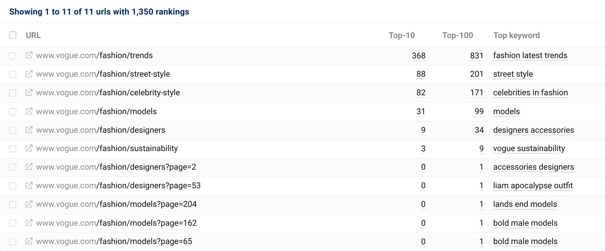
What they are doing so skilfully that is making this content directory perform so well:
- Topical authority, Vogue have positioned themselves as experts in this space. They use their own imagery and information from first-hand experiences at real events to help them do this, as well as a team of expert authors and photographers.
- Content format structure, the hubs like “Fashion trends” are structured in a way that has a level of interactivity and purpose to every content block. For example they have blocks for the latest trends, trend types (e.g. seasonal) and trend videos.
- Content types that suit the expectations of users. Vogue uses a lot of imagery, for example in their street style section they often feature large collections of high quality, curated imagery. These tend to include anything from edits from Vogue employee’s to top trends seen at recent events.
Where I think Vogue.com’s fashion directory really stands out is in the organisation of it: it’s simple but also a unique take on typical content ‘hubs’ that are commonly used by publications. It’s far more common to see a content hub that is just a list of articles ordered by publish date rather than a curated and interactive landing page that’s providing the most relevant and recent information at the same time.
Summary & additional interesting observations
As always, completing analysis like this allows us to spot some common trends and interesting observations which don’t always fit into the winners analysis. Here are some of the things we spotted whilst reviewing these visibility leaders in women’ fashion:
Category coverage is absolutely key for eCommerce
One standout observation for online retailers in general is that category coverage has a massive impact on overall visibility. Both Boohoo and Bravissimo do this well but so do all the other high performing sites that sit amongst them in the search results.
Obviously to create new categories you will need to have ample products available that are relevant to that category. But you may find that there are some facets of categories or category variations that could be created within your existing product lists. Think about colours, types, styles or any other relevant product features that users may append to a search.
Adaptability to new trends and opportunities
Something that I spotted whilst reviewing all of the high performing retail sites in this space is that there were some a-typical product categories. For example, PrettyLittleThing.com has a landing page for “jeans and a nice top” – this is a great example of translating everyday speech into landing pages that potential customers will see benefit in. Some other notable examples of this are; day drinking dresses and brunch outfits, which are both landing pages on Boohoo. This plays into the point above, category coverage doesn’t mean launching a new product range.
Categories based on an aesthetic and not just product type
Another related point to both of the above, is that PLPs don’t just have to be based on a product type or combination of features. Boohoo (and many others), have categories based on aesthetics and current styles, which are likely to be informed by social media trends. For example “preppy outfits”, “baddie outfits” and “balletcore” are all categories on the Boohoo website and they’re also present on quite a few competitors.
Customer service in eCommerce
An interesting observation when looking outside of the winning directory for Bravissimo was how much focus they put on addressing their customers’ needs. It’s hard to definitively prove this is a major contributing factor to their success in the SERPs but it’s very likely. They understand that their customers typically have trouble finding that perfect fit so every step of the purchasing journey with them has a clear CTA or message to solve questions. I would say this provides a generally satisfactory user experience for their prospective customers and as a result gives them an advantage in the SERPs.
Informational gap on retail sites
One final observation to wrap this up, informational content seems to be missing from a lot of retail sites. Possibly it’s that they don’t see the value in it, but in fashion it seems there is still a desire for users to look for inspiration and fashion advice via organic search. Lots of the latter is opinion based and unlikely to be satisfied by low effort content, so a brand that puts effort into fashion advice content could really gain some visibility here.