The loading time of a website, also called PageSpeed, is now an official ranking factor in Google search. The new user-centred measurements that make up the “Core Web Vitals” will become an integral part of how search results are ordered with the Page Experience Update in mid-2021.
- How do I optimise the loading time of my website and increase Google PageSpeed?
- Many things become easier with HTTP/2
- Reduce the size of the website
- Activate server-side compression
- Compress all images
- Embedding images in native resolution
- Avoid downloading unnecessary data
- Reduce latency
- Optimise rendering path
- Loading JavaScript asynchronously or defer
- Load necessary files in advance
- Load critical CSS prioritised
- Optimised loading of WebFonts
- Skip layout and paint with content-visibility
- Ensure visual stability
- Further information on this topic:
However, the topic of PageSpeed is anything but new. As early as mid-2009, Google launched an initiative for a faster internet under the motto “Let’s make the web faster” and thus laid the foundation for the new ranking factor. Over the years, loading time has become an increasingly important quality criterion for Google.
The loading time of a website has always influenced important user signals: a fast website has a positive effect on the bounce rate, the return-to-SERP rate and the dwell time. It also has a positive impact on the click-through rate in the SERPs and the number of page views, and it even has a direct influence on the conversion rate. Thus, PageSpeed was already an indirect ranking factor since the use of user data, and it is now being upgraded to a full-fledged ranking factor.
The PageSpeed of a website can usually be increased in the long term by considering and optimising the following points:
How do I optimise the loading time of my website and increase Google PageSpeed?
First of all, there are two different factors that influence the loading time of a website: firstly, the size of the website, i.e. the data that has to be transmitted, and secondly, the latency of the web server, i.e. the time that passes due to delays without data being transferred.
In general, the larger the amount of data to be transmitted and the smaller the available bandwidth, the longer the time that is required for transmission. Therefore, the goal of any PageSpeed optimisation must be to reduce the amount of data or the size of the website.
However, since modern websites consist of countless small files such as HTML, CSS, JS, WebFonts, etc., the latency, i.e. the length of time between request and response, also has an enormous influence on the overall loading time of a website.
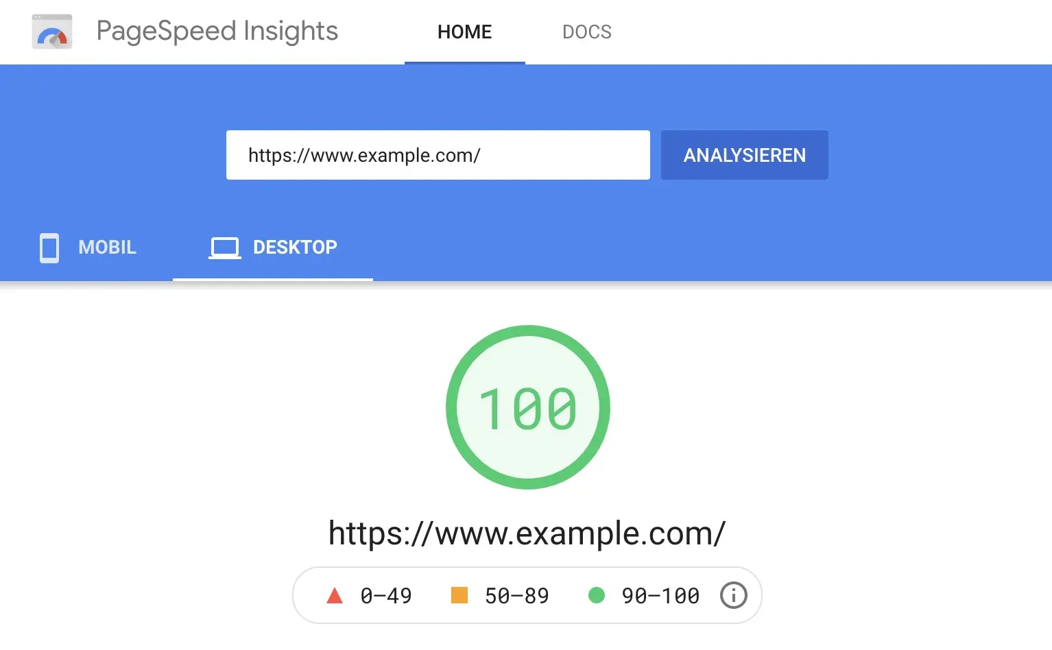
Recently, since the introduction of Core Web Vitals, the visual stability and responsiveness of a website have also been included in the calculation of the PageSpeed score, so these points should also be taken into account.
Many things become easier with HTTP/2
One of the simplest and most effective measures to improve the loading time is to switch the web server to the HTTP/2 protocol. This successor to HTTP 1.1 was designed with a focus on improving the performance of websites and brings with it a number of improvements.
For example, with HTTP/2 it is no longer necessary to reduce the number of requests (so-called HTTP requests). The use of so-called multiplexing removes the limitation of 10 simultaneous file transfers in the browser per host. This means that any number of files can be transmitted simultaneously via a single connection.
In concrete terms, this means that you can avoid the combination of stylesheets and JavaScript files into one file or the use of large CSS Sprites instead of many small images.
Another feature of HTTP/2 is the server’s ability to send multiple responses to a single browser request to the user. This means that in addition to responding to the original request, the server can push additional resources to the client without the client having requested them itself. This allows files that the browser needs to display anyway to be loaded in advance, which can significantly reduce the effective loading time.
Info: The GoogleBot now also supports HTTP/2
Reduce the size of the website
The most important measure in PageSpeed optimisation is to reduce the number of files that need to be transferred. The smaller the website, the faster it can be loaded. Various methods are available for this purpose:
Activate server-side compression
Text-based data formats such as HTML, CSS and JavaScript can be reduced enormously via server-side compression. With the so-called gzip method (a short form for “GNU zip“), these can be reduced in size very quickly and easily. A “zipped” HTML file, for example, can become up to 70% smaller.
GZIP should be activated on every website because web server applications such as Apache and NGINX have mastered gzip compression for years. Modern browsers can easily interpret the compressed files and extract them while the website is being rendered.
A more modern method, which is now also supported in all modern browsers, is the so-called “brotli” algorithm. Brotli was developed by Google developers in Zurich and named after a Swiss pastry. Compared to GZIP, Brotli can achieve a 20% improvement in compression. The processing speed remains about the same.
Compress all images
The largest files downloaded for the presentation of a website are usually images and graphics such as logos, photos, or illustrations. These can be optimised specifically for use on the web.
If you use Photoshop, this can be easily selected with the “Save for Web” option, below the “Save” option. This dialogue is used to optimally reduce the size of the images. Online tools such as TinyPNG or TinyJPG help to optimise existing image files afterwards.
The selection of the optimal file format also plays a role in optimising the size of images. For graphics, PNG files are often smaller, whereas for photos, JPEG files are usually the smaller files.
WebP is another, more modern method that can be used for a variety of photographic, translucent and graphic images. WebPs typically achieves 30% higher compression than JPEG.
With AVIF and JPEG XL, the successors to Web graphics are already in the starting blocks. Both formats combine the advantages of JPEGs, PNGs, Gifs and WebPs and could become the de facto standard format on the internet in the future.
AVIF is a modern image format based on the AV1 video format and is already supported in Google Chrome from version 85 onwards and in Firefox from version 86 onwards. AVIF files are about 20% smaller than comparable WebP files and 50% smaller than comparable JPEG files.
The newer JPEG XL has a similar compression quality to AVIF but offers some additional functions. As JPEG XL is still under development, it is not currently supported by any browser.
Embedding images in native resolution
In addition to the correct compression, it is extremely important that images are only downloaded in the resolution that is displayed. Therefore, photos in camera resolution should never be published unprocessed on a website, and images should never be scaled down using CSS properties or HTML attributes.
If a graphic is displayed on the website with 400×300 pixels, the embedded file should be uploaded and embedded in exactly this resolution.
For different resolutions in different devices through flexible layouts, suitable images can be loaded in the <source> using so-called Responsive Images through the <picture> element:
<picture>
<source media="(min-width: 800px)" srcset="screenshot.jpg, screenshot-2x.jpg 2x">
  <source media="(min-width: 450px)" srcset="screenshot-small.jpg, screenshot-small-2x.jpg 2x">
  <img src="screenshot-fb.jpg" srcset="screenshot-fb-2x.jpg 2x" alt="Screenshot der Website">
</picture>
Instead of specifying a fixed size and pixel density for the images, the sizes of all images provided can be specified in the <img> element by adding a srcset attribute. This allows the browser to automatically calculate the effective pixel density and select the best image for download.
<img src="screenshot-200.jpg" sizes="50vw"
     srcset="screenshot-100.jpg 100w, screenshot-200.jpg 200w,
             screenshot-400.jpg 400w, screenshot-800.jpg 800w,
             screenshot-1000.jpg 1000w, screenshot-1400.jpg 1400w,
             screenshot-1800.jpg 1800w" alt="Ein Screenshot">
Avoid downloading unnecessary data
In general, it is important to avoid downloading files from the browser that are not required in order for the website to be displayed. For example, web fonts, icons and JavaScript libraries should only be loaded if they are actually used on the website.
“Lazy loading” ensures that only those images that the user gets to see are downloaded. For example, if an image is placed at the very end of the page and the visitor does not scroll down that far, the image file does not have to be transferred at all.
In older browsers, this had to be implemented using JavaScript; modern browsers support lazy loading via attributes in images and iFrames.
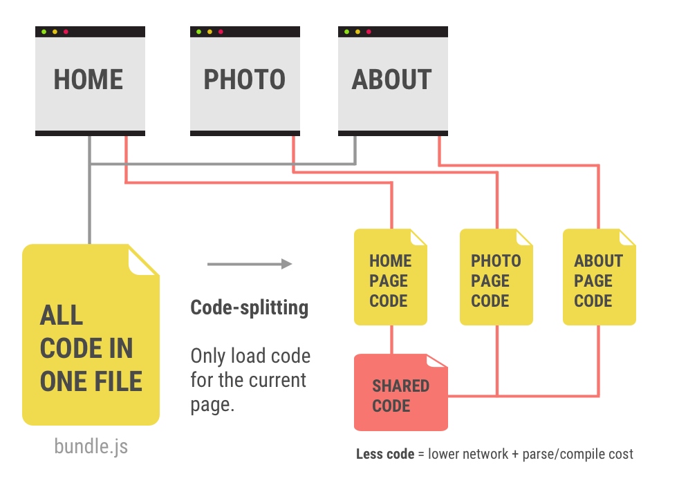
With larger CSS and JavaScript libraries, part of the transferred data is sometimes not required for certain webpages and can be reduced accordingly.
Modern web applications can be automatically divided into necessary packages through a modular approach to development and the use of code splitting (for example, using Webpack).
Reduce latency
High latencies and access times are particularly detrimental for the loading time of a website, because no data is transferred while the browser is waiting for the web server’s response and the entire loading process is delayed.
One of the most important steps is therefore to optimise the so-called Time To First Byte (TTFB). This indicates the time the browser must wait until it has received the first byte of the response to its request. This value can be improved by a good connection and a more powerful hosting infrastructure.
Server-side caching, server-side rendering and the use of static page generators can reduce the delay by generating the source code for dynamic websites on the server. Ready-generated HTML can be stored in the main memory (RAM) or on fast SSDs with NVMe, for example, and delivered immediately on request.
As the operator, however, you have only limited influence on the website’s latency. If the user’s connection is poor due to a bad mobile connection, the provider is not in a position to improve the connection.
However, by using a so-called CDN (Content Delivery Network), the website data can be stored in globally distributed, well-connected data centres, which increases the probability of a fast connection to the user.
Optimise rendering path
With modern websites, optimising the so-called critical rendering path is becoming increasingly important. This refers to the steps that the browser must take from the HTML response of a page to the rendering of the pixels on the screen.
First, the elements are extracted from the HTML document and transferred into the so-called DOM tree (Document Object Model). The so-called CSSOM tree (CSS Object Model) is then created by applying the information from the stylesheets.
The JavaScript is then executed, and the finished rendering tree is created. Once this is done, the layout, i.e. the position and size of all elements, is generated and the web page is drawn.
Loading JavaScript asynchronously or defer
By deferring scripts that are not immediately needed, the loading process that is visible to the user in the browser can be accelerated enormously. If the Lighthouse Report or Google’s PageSpeed Insights Tool shows the message “Eliminate render-blocking resources”, styles and scripts should be dealt with later or reloaded.
This is done with JavaScript using the attributes “async” and “defer”:
<script async="async" src="/scripts.js"></script><script defer="defer" src="/scripts.js"></script>At first glance, both attributes have the same effect, as the page is loaded much faster because the script no longer blocks the processing of the other HTML code.
The difference between the two HTML5 attributes “async” and “defer” lies in the execution of the scripts.
With the “async” attribute, they are executed immediately after the HTML loading process has been completed and do not adhere to the order of integration. With the “defer” attribute, on the other hand, the scripts are processed in the intended order, but they are only executed after the DOM has fully loaded.
Load necessary files in advance
As already described in section HTTP/2, the files that are required for an HTML page can be transmitted in the HTTP header of the server response via the server push procedure for preloading. With the Apache web server, for example, this is done with the following code via the .htaccess file:
<FilesMatch "index.html">
    Header add Link "</css/styles.css>; rel=preload; as=style"
    Header add Link "</js/scripts.js>; rel=preload; as=script"
</FilesMatch>
As an alternative to the HTTP/2 server push, necessary resources, such as CSS, JavaScript, image and font files, can also be transmitted in the <head> area of the HTML for preloading:
<link rel="preload" href="style.css" as="style">
<link rel="preload" href="main.js" as="script">
<link rel="preload" href="logo.svg" as="image">
<link rel="preload" href="schrift.woff" as="font">
Load critical CSS prioritised
By default, integrated style sheets (CSS files) are also resources that block rendering, as the display would be impaired without CSS. For this reason, the required CSS should be split into different parts:
- A small amount of CSS, which is needed for the “first paint”, i.e. the rendering of all elements in the “above-the-fold” area. This so-called critical CSS should be integrated inline into the HTML document.
- An external style sheet should contain the other styles for the rest of the page. This means that it can be loaded without blocking the rendering of the critical area.
In order to load style sheets asynchronously, most browsers require a small JavaScript in combination with the <link> element for preloading, as well as a NoScript fallback:
<link rel="preload" href="styles.css" as="style" onload="this.onload=null;this.rel='stylesheet'">
<noscript><link rel="stylesheet" href="styles.css"></noscript>
In the future, HTML imports could be used to load style sheets that do not block the rendering process.
Optimised loading of WebFonts
In order to use a special font on a website that is not pre-installed on the user’s computer, so-called WebFonts must be embedded in the page. Google offers Google Fonts, an interactive directory of more than 1,000 font families for free use.
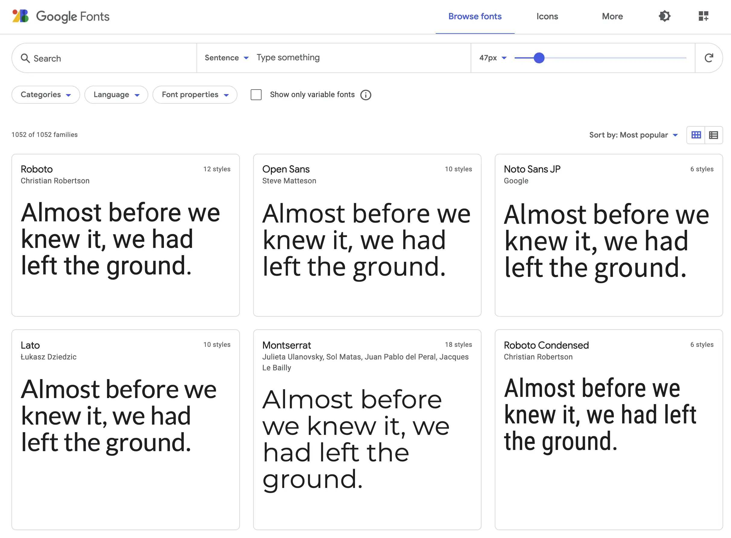
To speed up the loading process when using fonts from Google Fonts, which are loaded via the Google CDN, a preconnect to fonts.gstativ.com should be implemented at an early stage in the HTML:
<link rel="preconnect" href="https://fonts.gstatic.com">Afterwards, a specific subset of a font – in this instance, the 300 weight of the Lato font family – can be included. The addition display=swap ensures that the text is not hidden until the font has been loaded but is immediately visible (albeit initially with a default font):
<link href="https://fonts.googleapis.com/css2?family=Lato:wght@300&display=swap" rel="stylesheet">Ideally, however, the required WebFonts are stored directly on your own web server and loaded from there. This makes the additional domain resolution (DNS request) as well as the connection setup (TCP connection) and SSL encryption (handshake) with fonts.gstatic.com superfluous.
Skip layout and paint with content-visibility
The new CSS property “content-visibility”, which was built into the Chromium engine in mid-2020, is a real secret weapon when it comes to improving page-loading performance. This property enables the browser to simply skip rendering work of an element if it is not yet visible.
Content visibility is like lazy loading for images, but just for the display of entire HTML elements. The calculation of the layout (rendering) as well as the drawing of the pixels (painting) is skipped if a large part of the content is off-screen, which makes the initial loading of a page much faster.
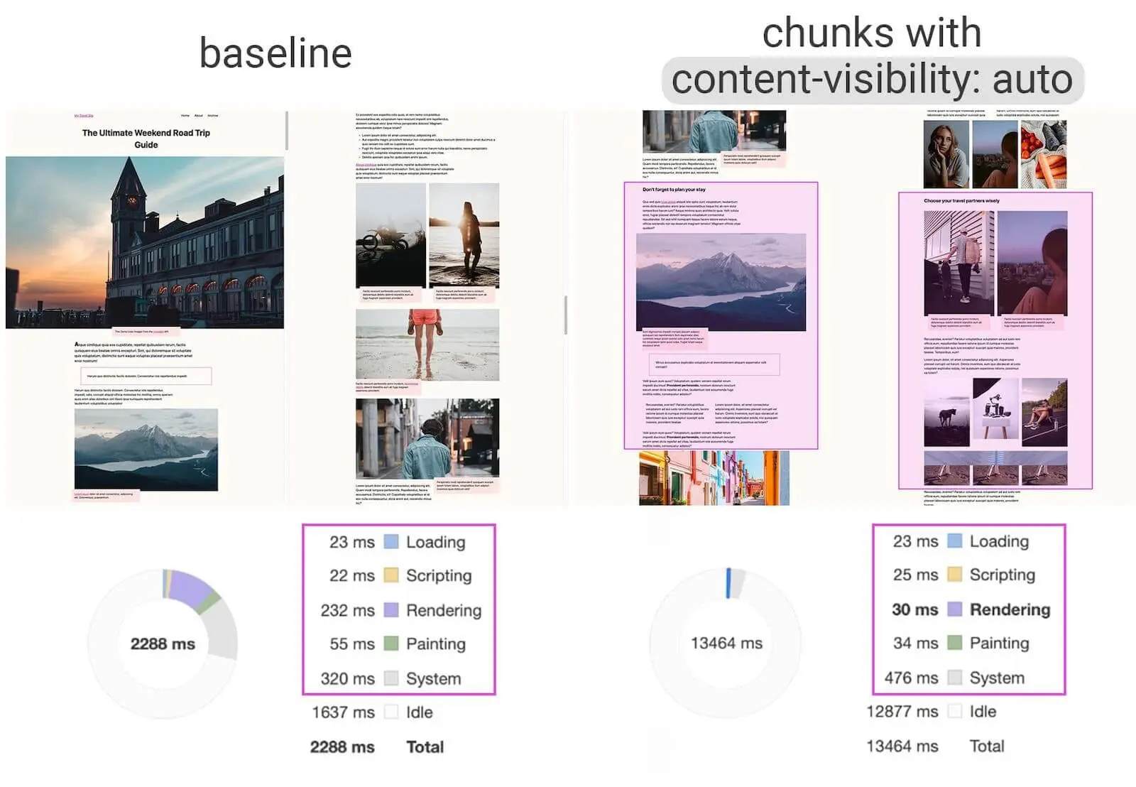
The optimised page also enables much faster interactions with the displayed content.
Ensure visual stability
A relatively new topic in PageSpeed optimisation is the so-called visual stability. This refers to changes in the size and position of elements that are already visible.
During the research on Core Web Vitals, it turned out to be particularly annoying when users wanted to interact with a page and elements such as links or buttons moved. This could lead them to the wrong page or cause them to take an unwanted action, leading to frustration for the visitors.
The so-called cumulative layout shift (CLS) is measured during the loading process and recorded over the entire life cycle of a website.
Google uses the CLS value from the Core Web Vitals to evaluate this effect, which is the product of the percentage of the affected area on the screen and the percentage of the distance of the shift:
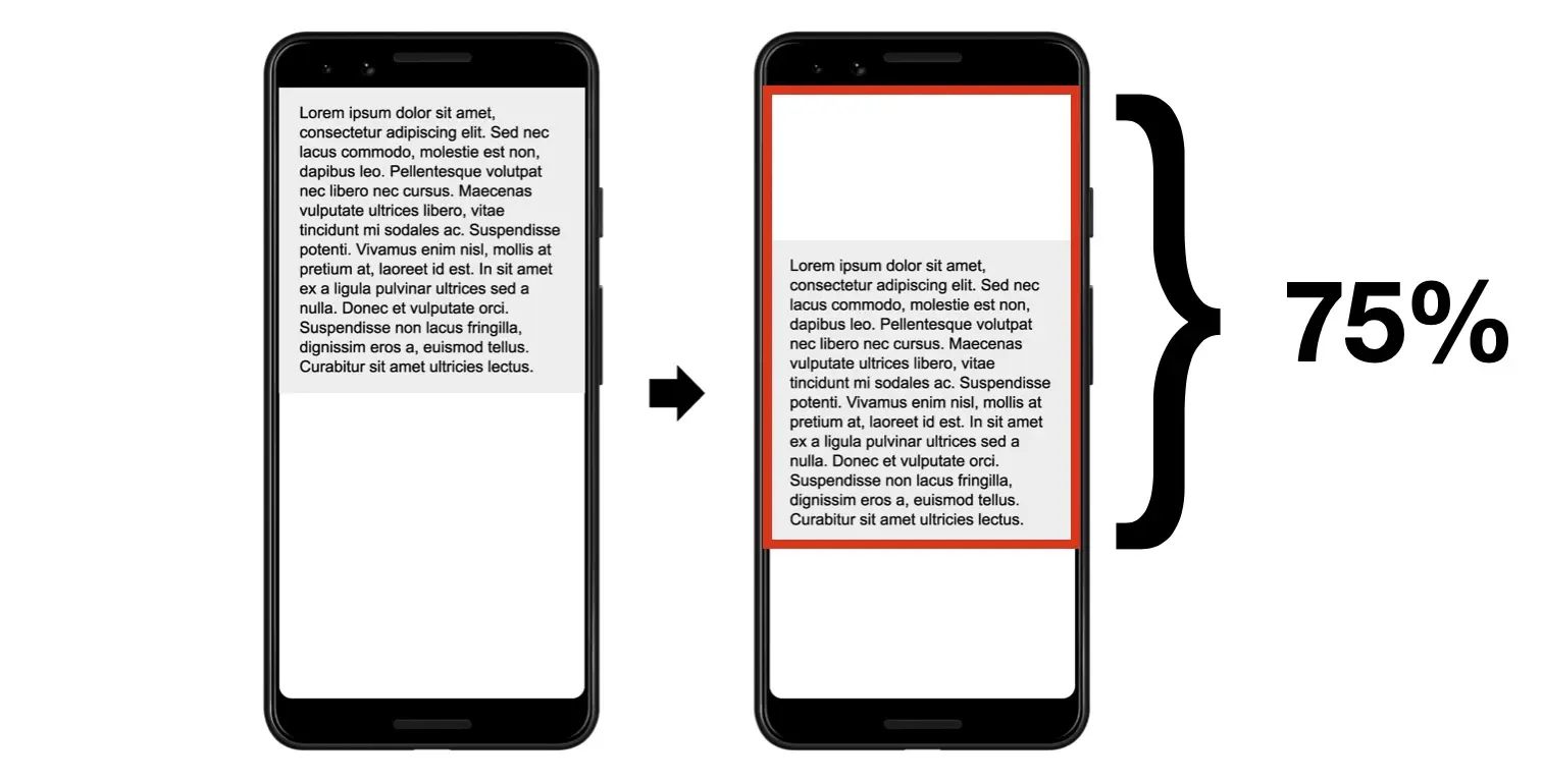
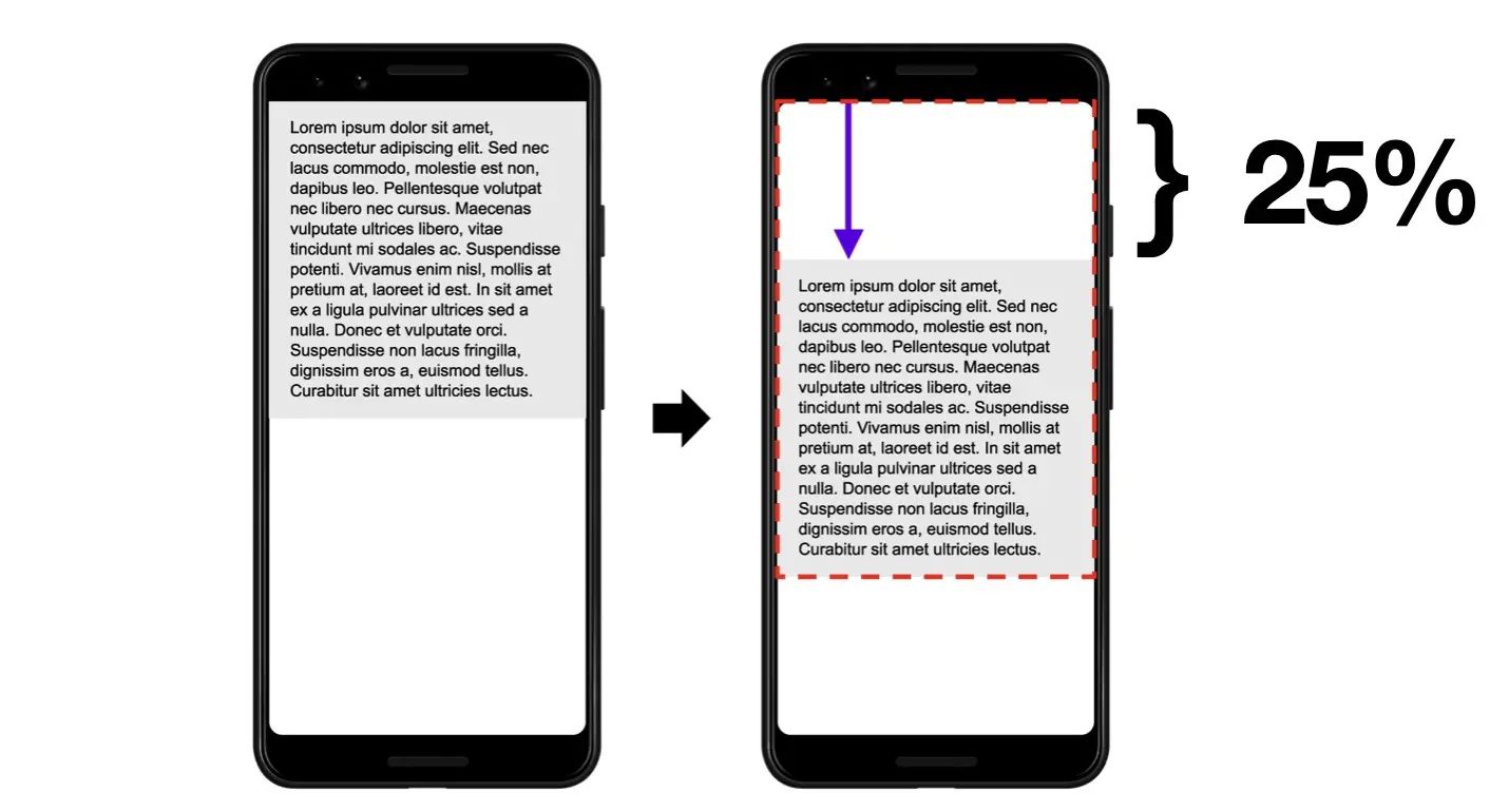
This results in a calculated CLS value of 0.1875:

A common error is the integration of image files without explicitly specifying their dimensions (height and width). In this case, subsequent elements, such as a text block, are pushed down during the loading process because an image is inserted above it that has yet to be loaded.
Logos in the header area of the page without a fixed size, responsive sliders that change in size after the content has been loaded or elements that are subsequently inserted via script also frequently cause so-called layout shifts.
Further information on this topic:
- Presentation (PDF document) by Ilya Grigorik, Web Performance Engineer at Google: Building Faster Websites – crash course on web performance
- Google’s developer page on “Make the Web Faster”: https://developers.google.com/speed/
- Google’s PageSpeed Insights tool to measure PageSpeed score and display Core Web Vitals field data https://developers.google.com/speed/pagespeed/insights/
- Blogposts in Google’s official Search Central blog on performance and speed: https://developers.google.com/search/blog – speed-and-google-search

